Traced from spaceNew map redefines Antarctic grounding line, a key step in sea-level rise researchPosted August 13, 2010
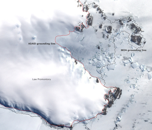
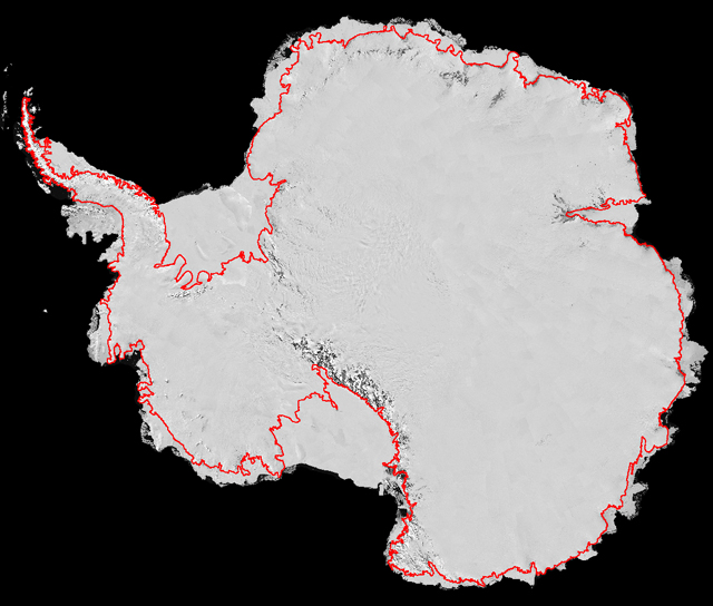
An international team of scientists used high-resolution satellite imagery to trace the most accurate map to date of Antarctica’s grounding line — a key step in helping determine how much of the continent’s ice is contributing to sea-level rise. Researchers connected more than 3.5 million geographic points around the continent to trace a 53,610-kilometer boundary where ice separates from the land. The map is a product of the Antarctic Surface Accumulation and Ice Discharge (ASAID) project Led by Robert Bindschadler of NASA’s Goddard Space Flight Center “This project has been a major achievement to come from the International Polar Year The data from ASAID will help resolve the mass balance of Antarctica — how much ice is lost to the ocean versus how much snow accumulates in the interior. It’s likely the continent is experiencing a negative mass balance, meaning more ice is flowing into the ocean than accumulating on the continent. How much ice is making it into the sea has been a tough question to answer. Previously, researchers calculated the speed of outflow from 33 of Antarctica’s outlet glaciers, including 25 of the 30 largest glaciers. But that accounts for just half of what is lost, as outlet glaciers make up only 5 percent of the coastline. The rest of the coastline might lose ice through icebergs that calve off from outlet glaciers or over land cliffs. Sometimes ice flows gently from glaciers that extend far into the ocean as floating ice shelves or skinnier ice tongues. In other cases, the ice never reaches the ocean at all. Earlier mapping efforts had included rocky outcrops and sometimes icebergs as part of the ice sheet perimeter, but elevation data and interpretation based on more detailed satellite imagery enabled the researchers to identify the ice perimeter more accurately. “ASAID doesn’t just show the location of the ice edge; it provides the elevation all along that line. That’s a key step in measuring mass balance because it tells you the ice thickness near the grounding line,” said Ted Scambos of the National Snow and Ice Data Center (NSIDC) U.S. collaborators on the ASAID project include Ian Joughin at the University of Washington
|


For USAP Participants |
For The Public |
For Researchers and EducatorsContact UsNational Science FoundationOffice of Polar Programs Geosciences Directorate 2415 Eisenhower Avenue, Suite W7100 Alexandria, VA 22314 Sign up for the NSF Office of Polar Programs newsletter and events. Feedback Form |


