|
Getting on the mapNew high-resolution mosaic of Antarctica offers unparalleled views of the seventh continentPosted December 20, 2007
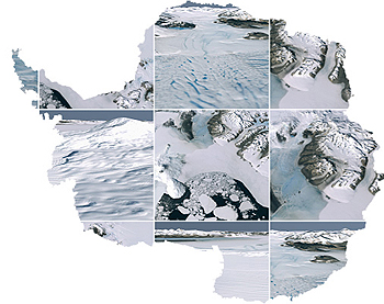
More Information After 25 years of conducting research in the Antarctic, glaciologist Robert Bindschadler finally got his wish — a true color map of the continent that offers unparalleled details of its features. “This was a dream come true,” said Bindschadler shortly before deploying to Antarctica for a project to study the interaction between ice and ocean at Pine Island Glacier. (See story Going to the edge for more information.) “I always wanted to get a mosaic of the continent, but as we learned now, it is a really big project to do,” said Bindschadler, chief scientist with the Hydrospheric and Biospheric Sciences Laboratory at NASA’s Goddard Space Flight Center. The Landsat Image Mosaic of Antarctica (LIMA) is the first major, tangible product to emerge from the International Polar Year (IPY), a multinational science campaign for intensive study of the polar regions from March 2007 to March 2009. LIMA’s a project the National Science Foundation (NSF) backed with nearly $1 million, and included collaboration from NASA, the U.S. Geologic Survey (USGS) and the British Antarctic Survey (BAS). In an NSF press release, Tom Wagner, Earth sciences program director for the NSF-managed U.S. Antarctic Program (USAP), said LIMA represents the spirit of the IPY in two ways. “Firstly, it’s an international collaboration between the U.S. and the United Kingdom, and secondly, the map and raw data are freely available to the world community of scientists, educators and the general public.” The map is a realistic, nearly cloudless satellite view of the continent stitched together from nearly 1,100 images captured by the NASA-built Landsat 7 satellite mainly from 1999 to 2001. The Landsat Program is a series of Earth-observing satellite missions jointly managed by NASA and the USGS. The first Landsat satellite was launched in 1972. “This mosaic draws on 35 years of experience by the USGS’s Earth Resources Observation and Science center,” said Barbara Ryan, USGS associate director for geography, in a release. With a resolution of 15 meters — half the length of a basketball court — the mosaic offers the most geographically accurate, true-color, high-resolution view of Antarctica possible, according to federal and BAS officials. The mosaic contains almost no gaps other than a bull’s-eye-shaped hole centered on the South Pole that radiates out to 82.5 degrees latitude. That’s because Landsat’s orbit doesn’t allow imagery of this hole, which the LIMA team filled with lower-resolution data. The map will have uses for research as well as for planning scientific expeditions. It will also be useful for operational missions on the continent. Scott Borg, director of NSF's division of Antarctic sciences, noted the mosaic offers a “critical snapshot in time” of Antarctica’s ice sheets, which contain more than 60 percent of the world’s fresh water. “Imagine a middle-school Earth-science student comparing landforms in the glaciated valleys of Antarctic to similar features in the Rocky Mountains or even comparing a rock glacier in Antarctica with some of the features scientists are studying in images from Mars,” he said. Paul Morin, with the University of Minnesota, was recently funded to create the Antarctic Geospatial Information Center (AGIC), which will provide mapping services for the USAP. He said AGIC has already begun draping LIMA images over topographical maps. “We’re the people who will probably be the heaviest users of it,” he said of LIMA. “We’ll create products for both operations and science.” ;)
Photo Credit: Peter West
Robert Bindschadler While most of the imagery used in the mosaic is already at least five years old, it provides important information for logistics planning. For example, Morin said he has received requests from people who operate the Long Duration Balloon (LDB) facility on the Ross Ice Shelf. “The people on the LDB project, they want to have LIMA on hand so that when they decide to cut the cord on the instrument package [while in orbit], they’re dropping it in a place where they can easily extract it,” he explained. For a scientist like Bindschadler, who relies heavily on satellite imagery, the LIMA map has another practical purpose: it’s seamless. And it’s free. That’s not the case with a lot of similar quality imagery, requiring researchers to buy data sometimes before they receive funding for a project. “You just don’t buy data on the chance that you’ll get a proposal funded,” he explained. “LIMA is out there now to help people pose and formulate their science questions.” An expert on the West Antarctic Ice Sheet, Bindschadler now has easy access to look at its larger counterpart in the east. “It gets the scientific juices flowing,” he said. “It helps me formulate science questions that I might want to propose a project to pursue. And I think it’s going to be that type of tool for most scientists regardless of discipline.” LIMA is not the first mosaic of the continent. Bindschadler counted at least three previous models, but none of them offers the realistic views provided by the Landsat satellite. The first dates back to the mid-1990s, he said, using images from the Advanced Very High Resolution Radiometer (AVHRR) sensors on National Oceanic and Atmospheric Administration (NOAA) satellites. However, the resolution is only 1 kilometer. “That’s what you still see on Google [Earth],” Bindschadler said. “That’s going to change very soon. I know they’re working to add [LIMA] right now.” (In fact, a Google spokesperson confirmed the company added the mosaic as of Dec. 17. On the Google Lat Long Blog, which posts news from the Google Earth and Maps team, one of the Geospatial Information Systems specialists said the team was “really happy about this new imagery.”) Imagery from Radarsat-1, an Earth observation satellite developed by Canada to monitor environmental changes and the planet’s natural resources, and an instrument called MODIS (Moderate Resolution Imaging Spectroradiometer) aboard two different NASA satellites, created the other maps. “I think [LIMA] can boast being … the highest resolution and the only true-color mosaic of Antarctica out there,” Bindschadler said. “From a scientific point of view, it’s important to emphasize that it is complemented by these other mosaics. It doesn’t replace them.” One of the biggest challenges in creating the mosaic was finding cloud-free images of the Antarctic Peninsula. That difficult task fell to BAS, which has its logistics hub, Rothera Station, there. “The Antarctic Peninsula is our work place, and it is here that we have witnessed some of the most dramatic changes in recent years,” said Andrew Fleming, the remote sensing manager at BAS, during a Nov. 27 press conference when LIMA was unveiled. “The area has experienced a temperature rise of almost three degrees in the last 50 years, which is almost 10 times the global average. “LIMA will provide the new, high-resolution image which will contribute to the studies of these changes,” he added. Said Bindschadler during the same press conference, “This innovation is like watching high-definition TV in living color versus watching the picture on a grainy black-and-white television. Landsat data don't just give us this snapshot, they provide a time-lapse, historical record of how Antarctica has changed and will enable us to continue to watch changes unfold.” NSF-funded research in this story: Robert Bindschadler, Goddard Space Flight Center. |

For USAP Participants |
For The Public |
For Researchers and EducatorsContact UsU.S. National Science FoundationOffice of Polar Programs Geosciences Directorate 2415 Eisenhower Avenue, Suite W7100 Alexandria, VA 22314 Sign up for the NSF Office of Polar Programs newsletter and events. Feedback Form |